project created while at Grande Circular Design
about
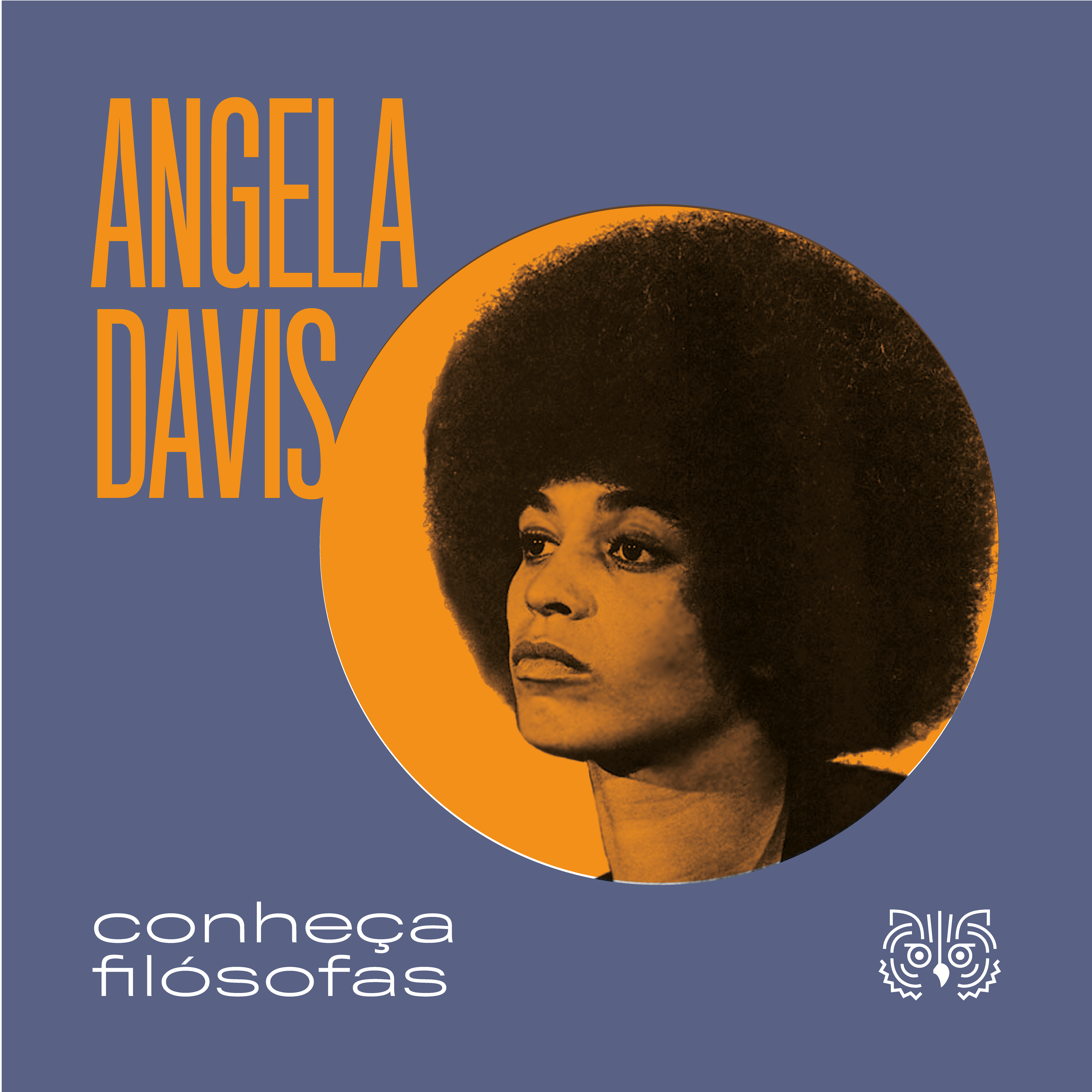
Anpof is an important institution for philosophy post-graduates. Some of the association's work includes: integrating all of philosophy studying centers, speaking up and defending educational interests at teaching philosophy in schools and engaging and disseminating knowledge around the country.
Therefore, it is essential for Anpof to have a well solved working communication and brand. The old logo, before the redesgin, did not express all of the association foward thinking and it's liveness.
moodboard
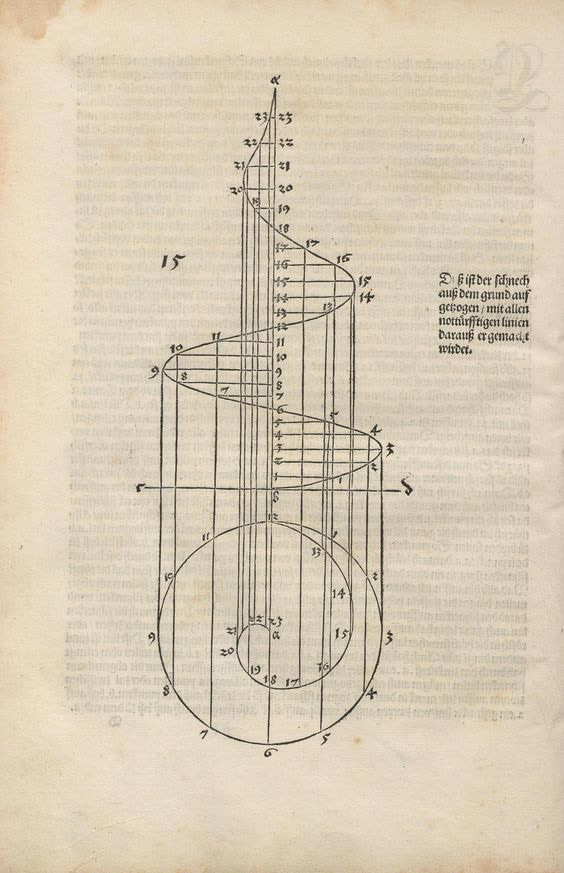

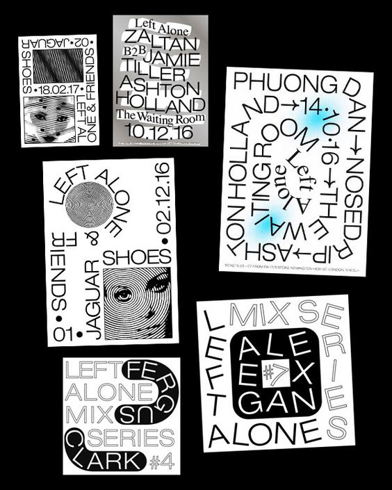
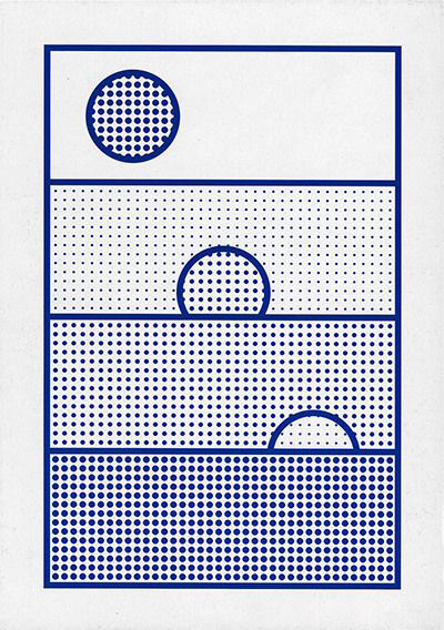
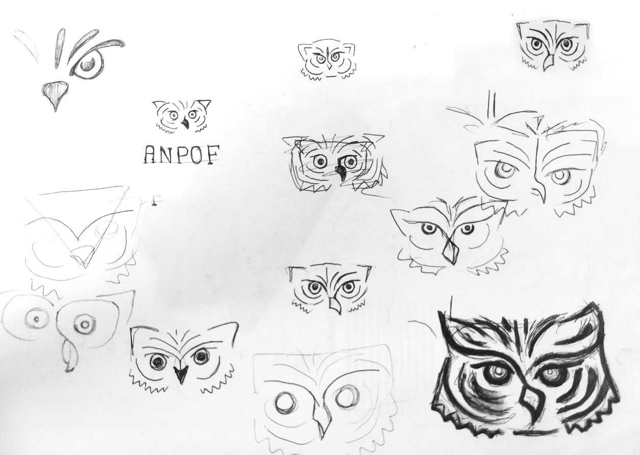
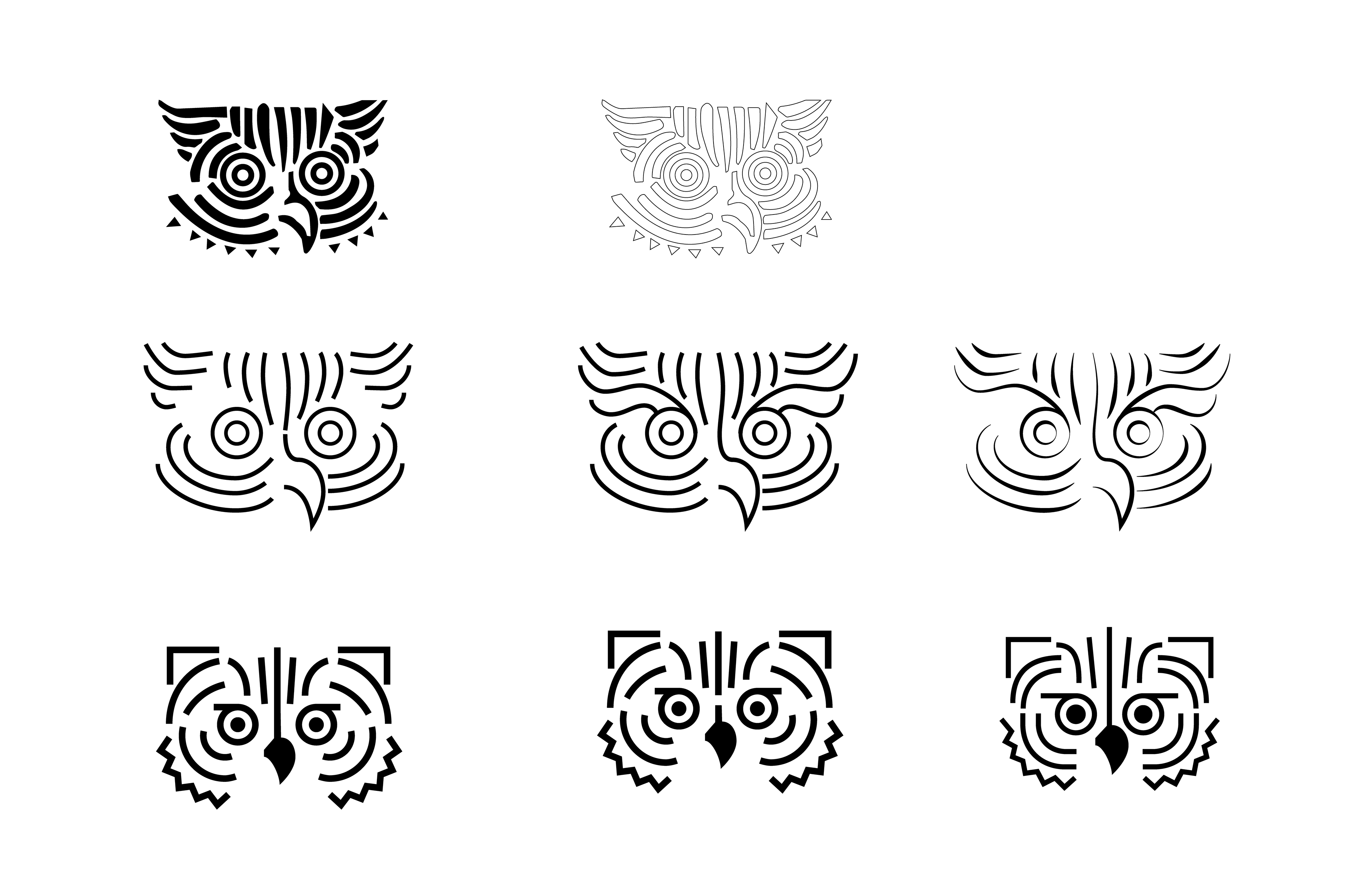
sketches
logo
The new logo is more contemporary and clean, yet it is edgy and remarkable. The logo remained to be an owl, wich is the traditional symbol for intelligence and knowledge, but much more simplified.
The logo was a result of the creative process that aimed to clean out the drawing and modernize it. It also included many tests that showed a good usability and great approval by the association's affiliated philosophers.
color palette
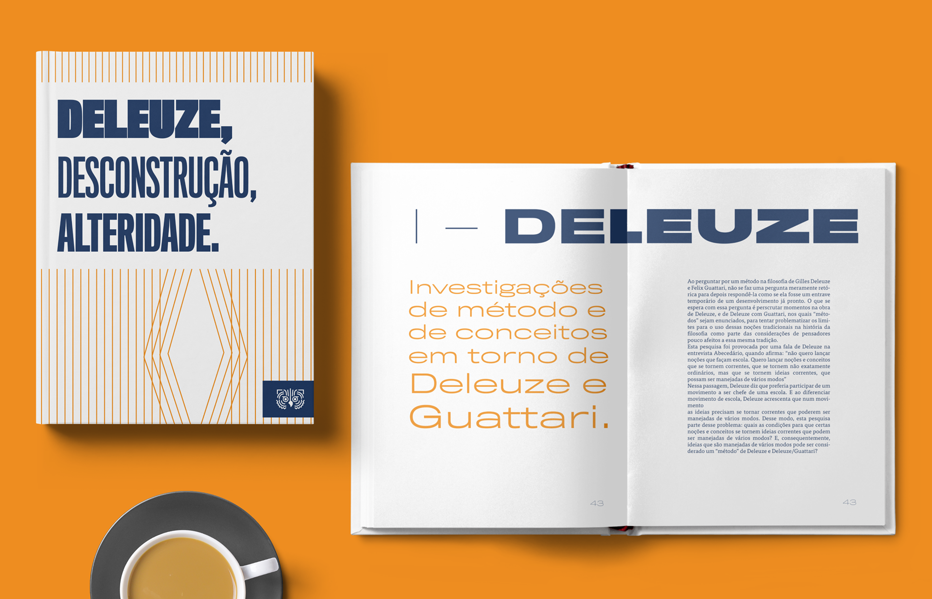
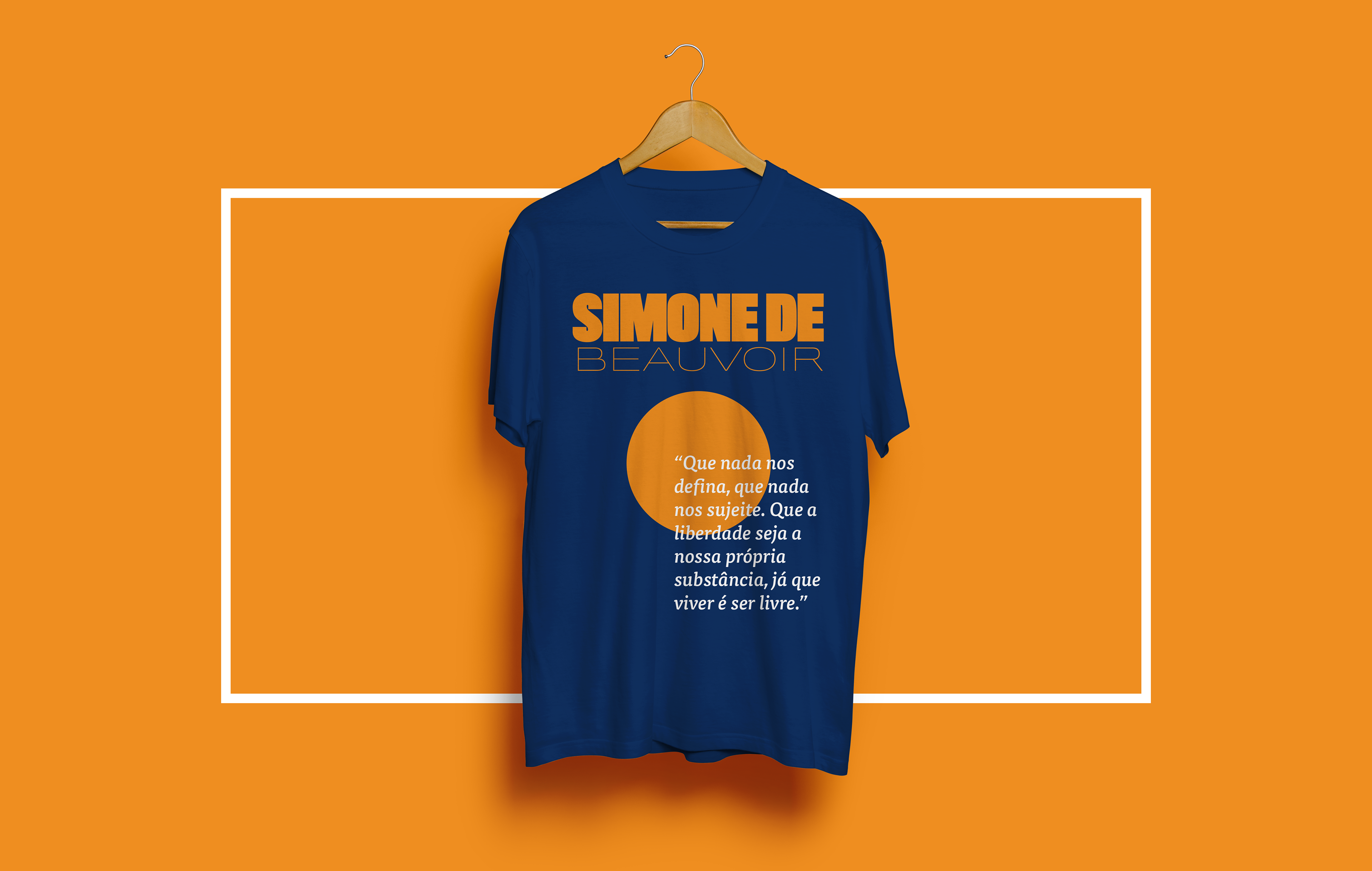
The color palette included a sober blue tone and a more vibrant and warm orange. The contrast between the colors makes it serious but still youthfull.
typography
The typographic choice was to pick a big font family, Tiling Gothic, wich delivered many features, like a range from ultra condensed to ultra extended and bold compositions to play with.
features
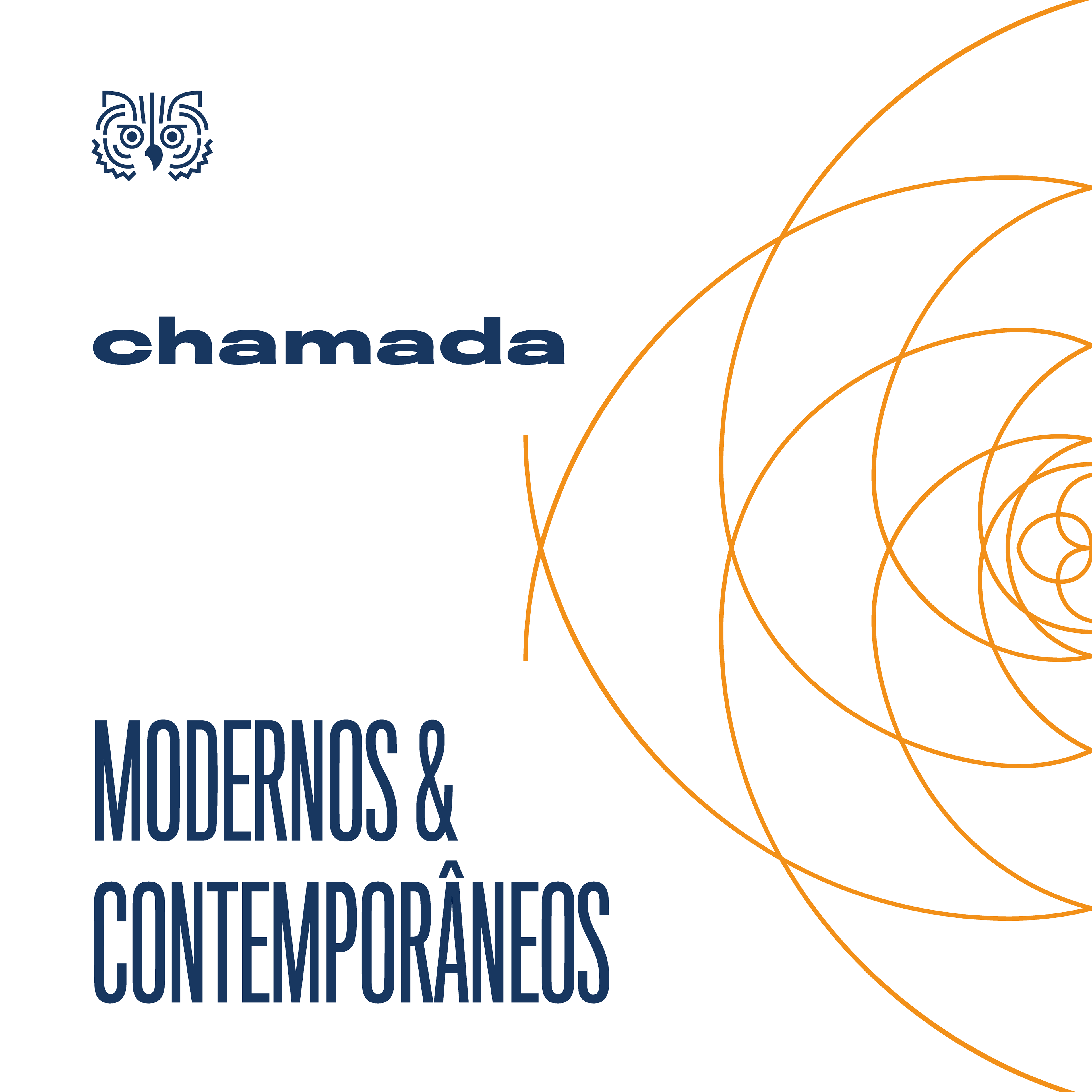
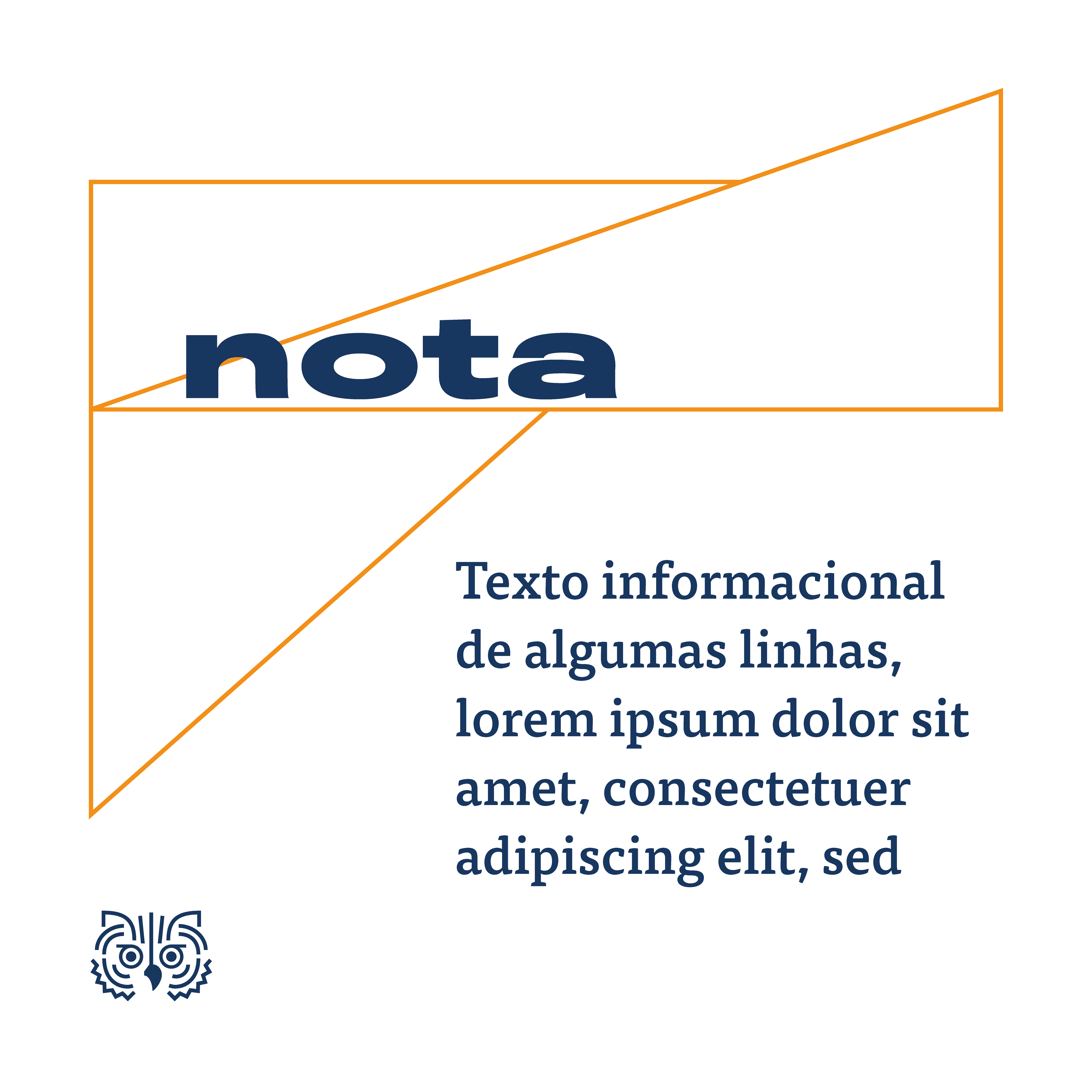
The feature elements to the brand communicates with the lines on the logo. They are simple and modern and were created to simulate math and logic thinking diagrams.
logo motion
institutional brand logo animation
social media templates
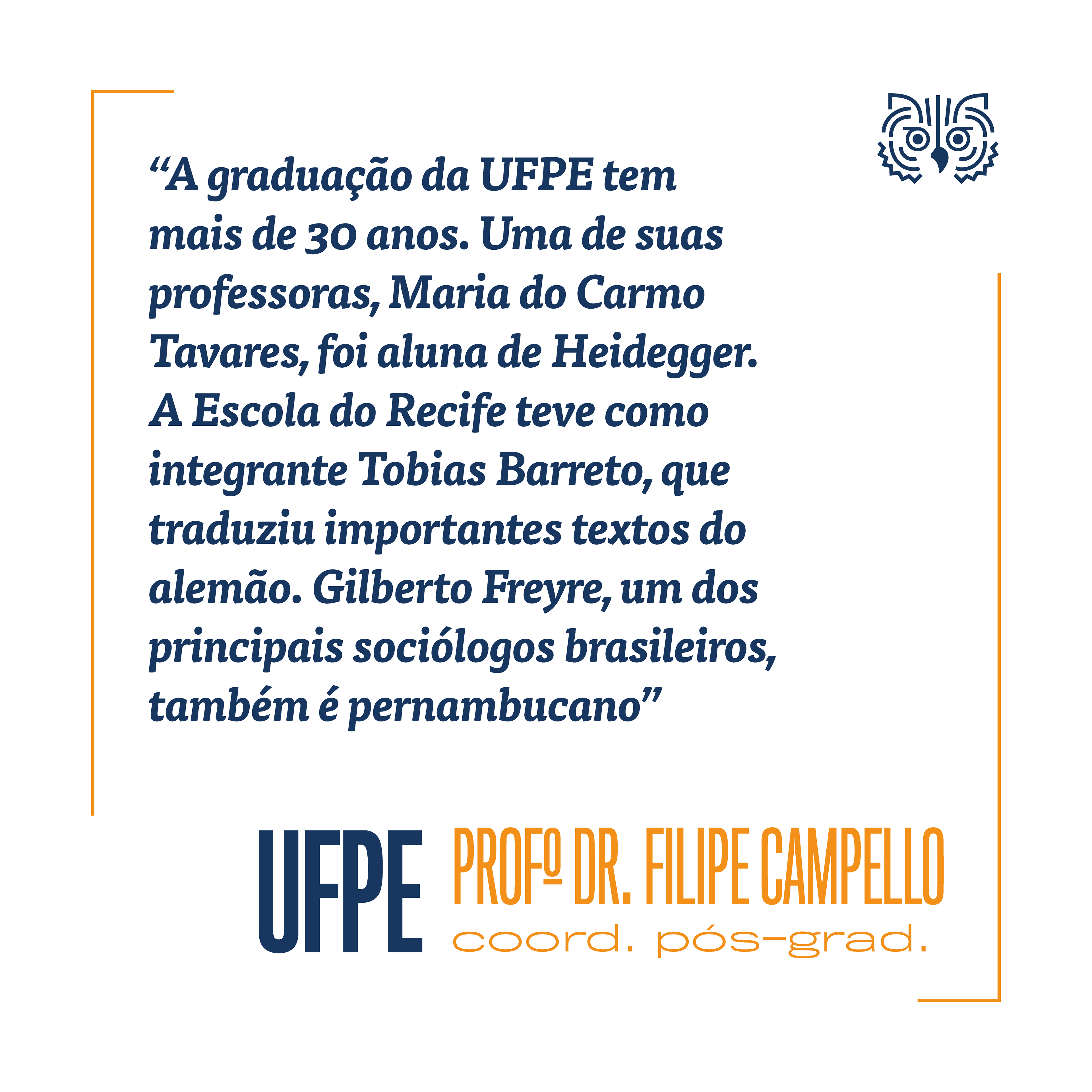

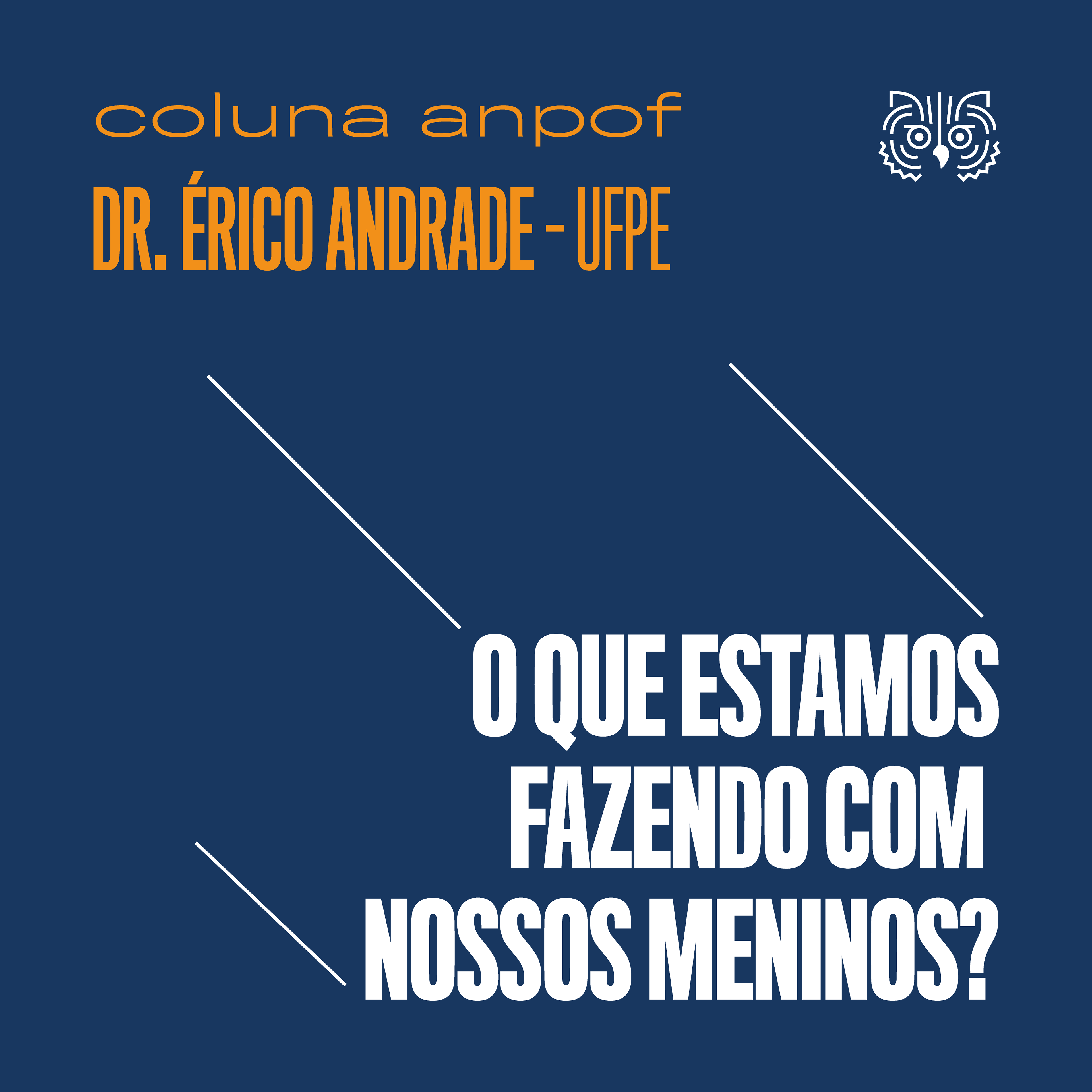
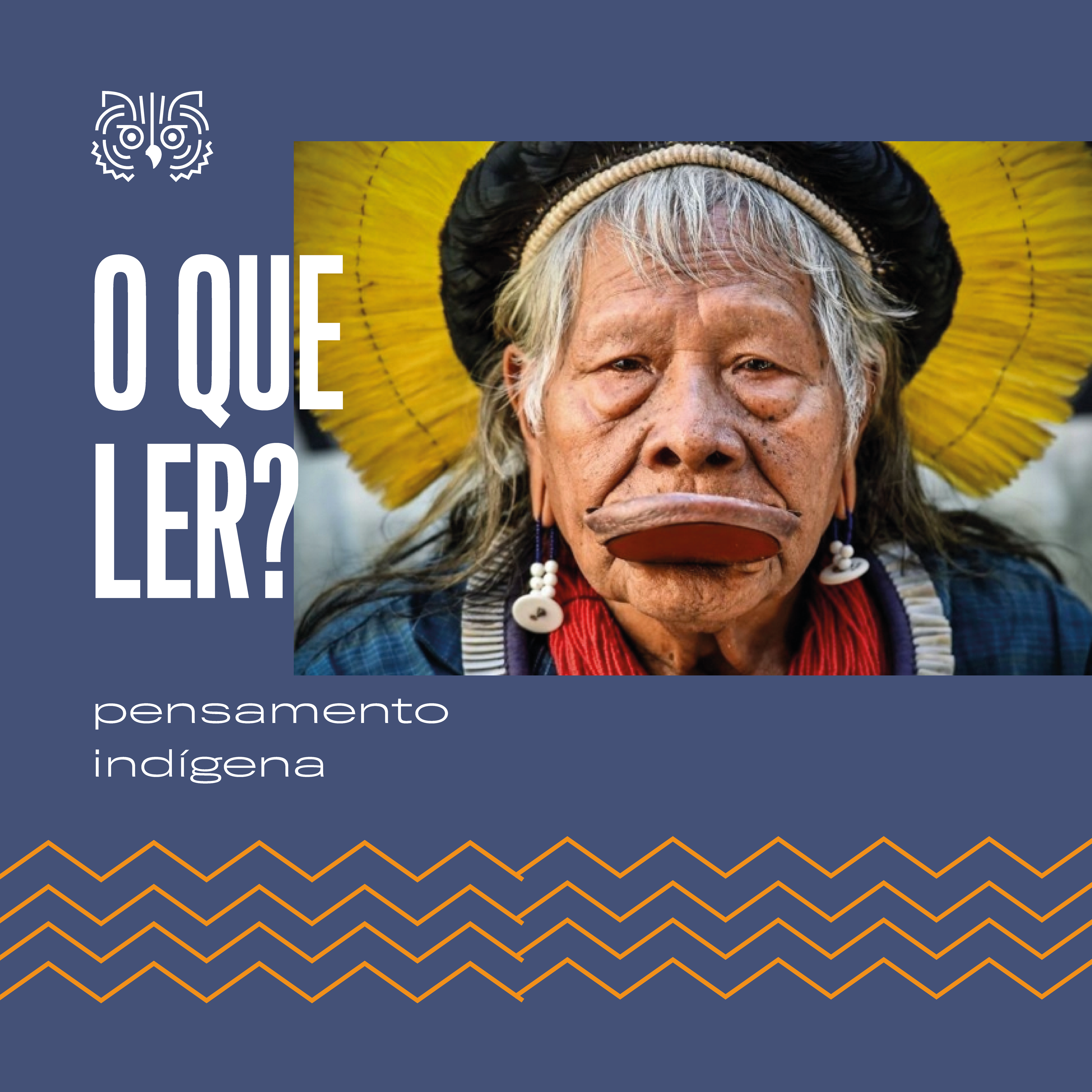
other usages
